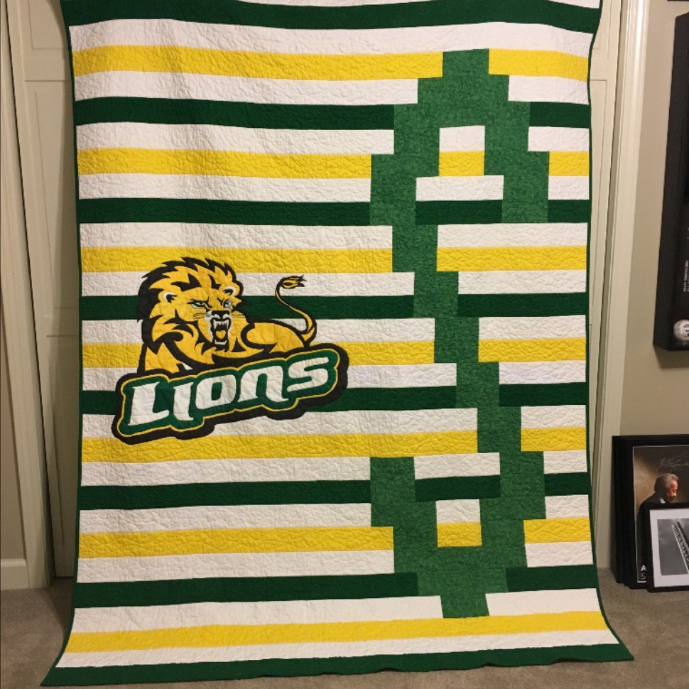
A quilt for college
My 24 year old son is going back to school. Hooray! He asked me to make him a quilt using the school colors of green and gold. He also requested a big S on it for Southeastern Louisiana University, and he asked for it to be big enough to "burrito" in. I created the pattern myself, but I felt like it needed something more than just the big S. I enjoy a challenge, so I set out to find a way to put the school's logo on it too. My daughter is a whiz at computers, so I asked her to print a picture of the logo. (See instructions below), She printed it tiled, so I taped all of the pages together, and then I created a stencil by stitching the lines without any thread in the machine. I quilted the logo using charcoal grey thread, but it didn't show up enough to suit me. Bummer! So then I set out to find a way to paint it, I have never painted on fabric before, and I'm not an artist, but I figured that I could paint in between the lines, and I like to push myself to learn new things. I used Tulip soft paint, and it took me the better part of a day to paint. I allowed it to dry for a few days before I resumed quilting it. I used matching color thread on each of the fabrics so that the quilting wouldn't be noticeable. I finished it last night, and he came over and got it right away. He loves it. :) I used Winline cotton batting for the first time, and I like it very much. It didn't shrink a great deal, and it remained soft after quilting. If I were to do it again, then I would try to put as much white fabric as I could underneath the logo. I had to paint quite a few coats to cover the dark green fabric, so it's a little scratchy in those areas. Luckily the paint softened a good bit after washing and drying. I dried it on the low heat setting, and I didn't let it stay in the dryer for too long. I was very pleased with how it held up in the wash. I asked my daughter to type up instructions for how she printed the logo, and this is what she wrote: To tile the image, I did a Google Image search to find the biggest resolution image available (something like 1500X1200, but the bigger the better). The image I chose had a green background, so I used Paint.net (a free software similar to Photoshop or GIMP) to erase the background. This isn't necessary, but saved on ink and made the image stand out more. I also cropped the image to make sure there was very little white space on the edges, before saving it. I then opened the image in Microsoft Excel. I resized the image on the Format Ribbon, making sure to maintain the aspect ratio. I knew that I wanted the width to be around 30", but the height was less important, so I set the width to 30", and the height adjusted accordingly (this is why very little white space on the edges of the image is important). The image was fairly grainy, even though I used the larger image size, but it worked just fine for my purposes. Excel will automatically tile an image on multiple pages. I happened to have access to print on 11x17 paper, so I changed to that paper size under Page Layout > Size. To see how it will tile, go to View > Page Break Preview. I then played with the page margins (under Page Layout > Margins) to get the best layout for my tiles. Once I was happy with the layout, I just clicked print! There are a million different ways to tile an image to end up with the same results, this is just what worked the best for me.

